Bravo for reimagining a 100year old travel icon
Shearings has been a beloved name in escorted travel since 1919. Founded by Herbert Shearings, this iconic brand has taken generations of holidaymakers through the UK’s and Europe’s rolling hills, seaside escapes, and cultural tours.
But after a century of evolution and a rescue from administration by Leger Holidays in 2020, the brand needed more than a touch-up – it needed a transformation.
Leger Holidays handed us the challenge of a lifetime:
• Reposition the brand to stand out from price-focused competitors.
• Rebrand visually to charm a younger generation.
• Revitalise the tone and personality to showcase a far friendlier side.
The stakes were high, and we knew we couldn’t rely on traditional research alone. Surveys from 2,500 travellers gave us insights, but here’s the kicker: humans only consciously communicate 5% of their thoughts. To unlock the real gold – the subconscious 95% – we teamed up with Neuromarketing expert Katie Hart.
Using EEG technology (electroencephalography – no, we still can’t pronounce it either) we recorded participants’ brain activity as they reacted to over 60 pieces of content, including logos, ads, and proof-of-concept designs.
The result? A treasure trove of 50 million subconscious data points that gave us a crystal-clear understanding of what Shearings’ travellers truly value – from visual cues to emotional reassurance.
Armed with this data, we reshaped Shearings from head to toe.
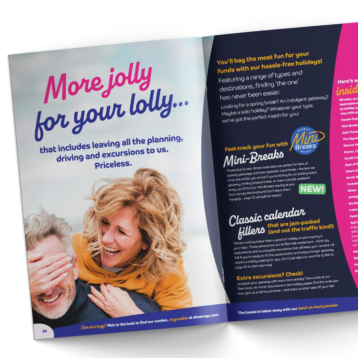
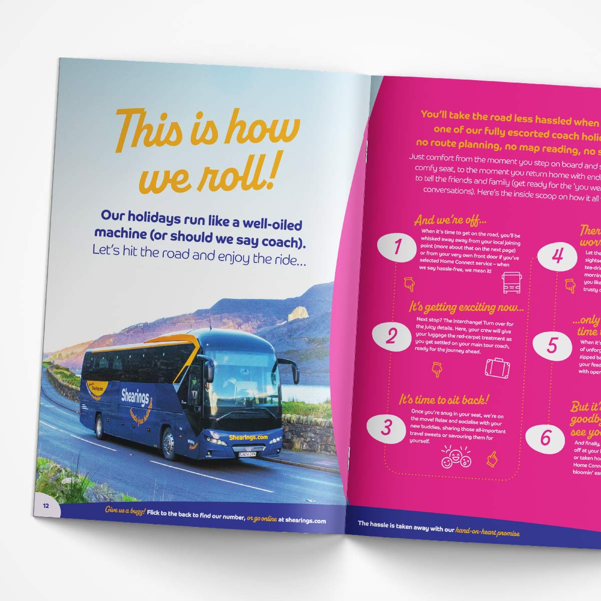
To reinforce the new no-nonsense tagline (Hassle-Free Holidays), we developed an all-new Hassle-Free Promise to address key concerns about convenience and reassurance, giving Shearings a critical edge over competitors. We revamped the tone of voice to not only blend approachability with Shearings’ iconic reliability but also make the brand feel like that entertaining yet trusted fun-loving best friend.
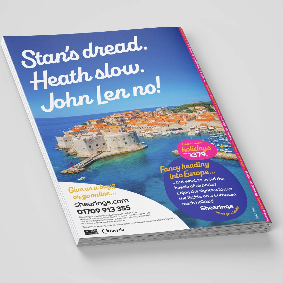
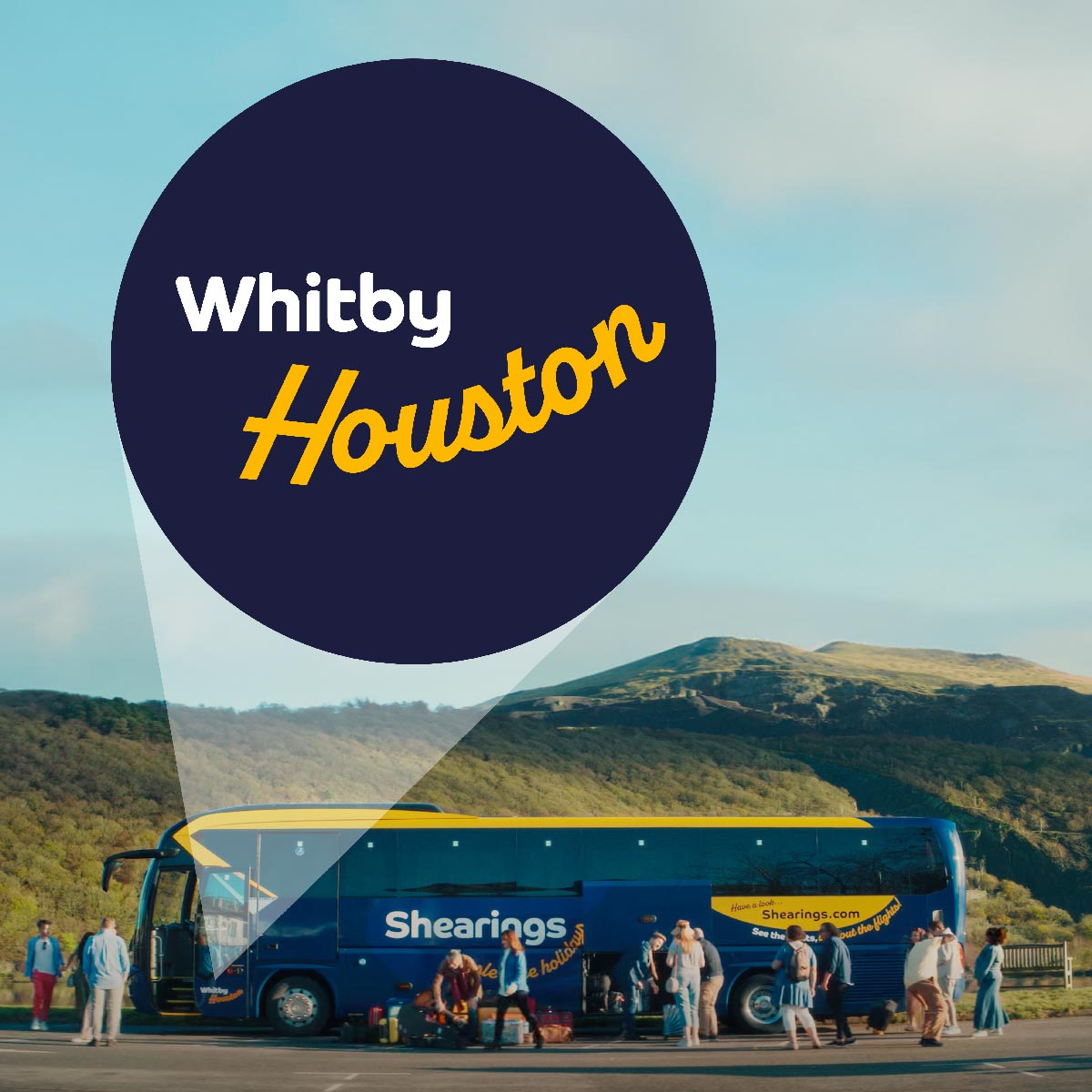
For that extra smile-in-the-mind, we created a fun naming convention for the fleet of coaches, with gems like Whitby Houston, Kilkenny Rogers, and Pink Fjord that all spark joy (and social media buzz) before the journey even begins.
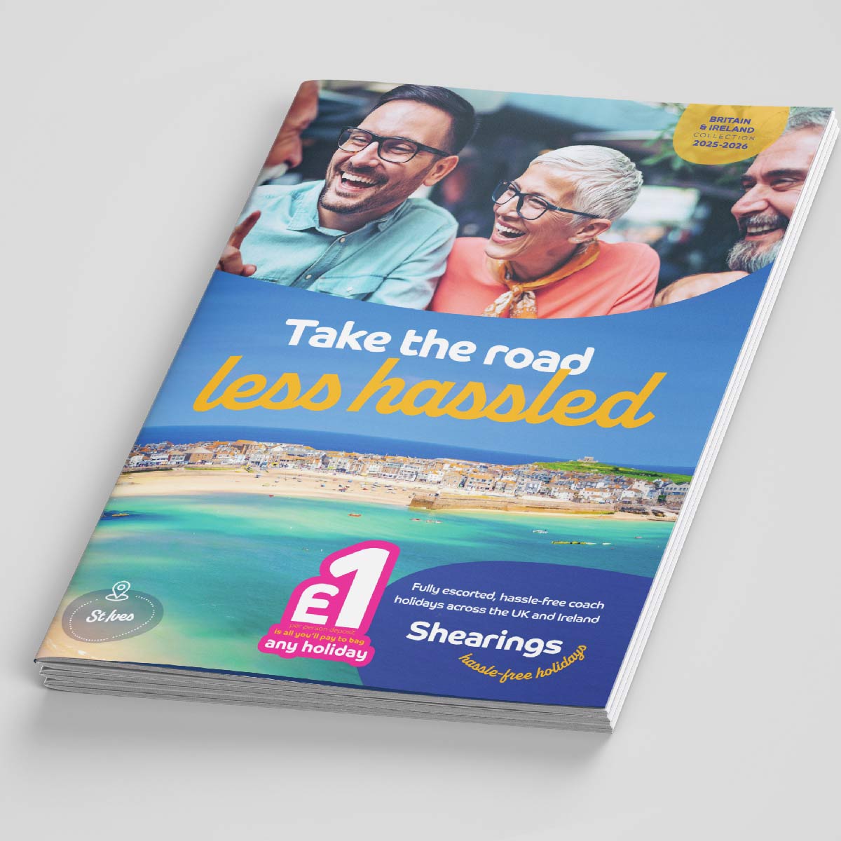
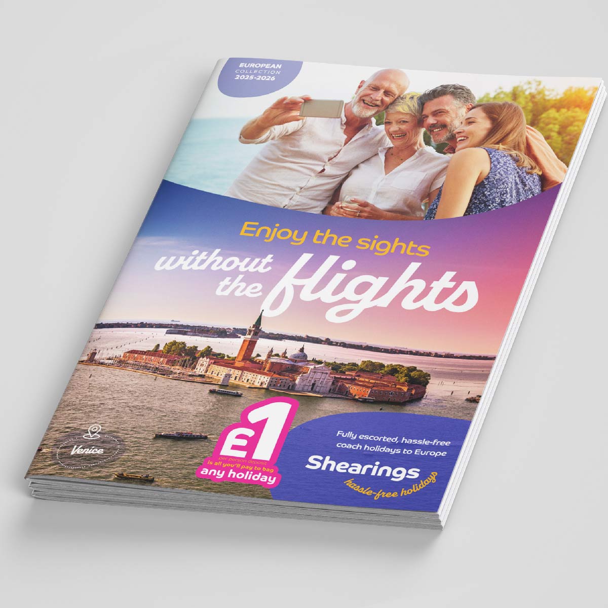
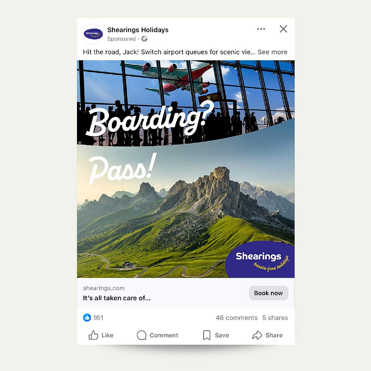
The revamped visual identity embraced vibrant colours, new typography pairing, fresh art-directed imagery, and a logo that visually represented Shearings’ new personality.
From strategic research to clever copy, we turned Shearings into more than a travel company – it’s now a joyful experience that begins long before departure.
The rebrand has been received incredibly well by customers, prospects and the industry.
Thanks to our strategic thinking, a century on, Shearings isn’t just surviving; it’s thriving.
We hope you approve Herbert :0)
SERVICES
• Repositioning strategy
• EEG research
• Brand consultancy
• Rebranding
• Visual identity & design
• Proposition creation
• Copywriting

Scroll down to view the rebrand
A range of visuals from the rebranding project