McD’s ‘raise your arches’ raises an important brand lesson (and how to avoid a disciplinary)
Every so often, a good ad comes along that gets our chins wagging. Usually, we have to be good girls and boys and wait until Christmas for a visual treat from the brands vying for our hearts and minds (thanks John Lewis for starting that proverbial snowball fight).
However, judging by the many articles and social media comments, Christmas has come early in the form of McDonalds’ ‘raise your arches’ ad. It’s fair to say this new campaign is helping to brighten the doom and gloom of Meh-urary. Especially for the ad’s target market – over-worked and hungry office workers craving more than a blandwich.
There are many reasons to like this ad. Fear not, I’ve whittled it down to just three in order to cover them swiftly before I get to what I believe is the ultimate takeaway for marketers (no McPun intended).
1: The bold strategy
So how do you successfully sell burgers to office workers? Well judging by this strategy, you completely defy convention and don’t show the product at all. That’s right, there’s not a solitary sesame seed in sight. It’s a classic ‘sell the sizzle not the sausage’ strategy. Although to be fair, this isn’t even selling the sizzle. It’s selling the craving for said sizzle. Try saying that quickly five times.
2: The brainwashed re-branding
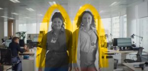
The boldness continues. Because if the absent product wasn’t enough, the brand has seemingly disappeared too. Or has it? Yes, there’s the initial M on the brand-coloured post-it note. But from then on, for 47 seconds in fact, we’ve been successfully brainwashed into recognising the famous golden arches are now anthropomorphised and represented as (the otherwise suggestive) double eyebrow raise. Oh, McDonald’s, how we bow at your immense brand power to be able to pull this off (more on this shortly).

The Hot Fuzz trick
3: The Hollywood-esque easter eggs
Directed by Edgar Wright of Hot Fuzz, Shaun of the Dead, and Baby Driver fame, the ad naturally feels cinematic. But as well as a great film director, Wright is notable for his visual choreography and easter eggs. And that makes this ad a feast for the eyes.
Beyond the obvious eyebrow grooving, Wright peppers the ad with easter eggs galore. There are Hot Fuzz-esque whiteboard tricks, and clever brand-coloured clothing throughout (the manager’s red tapered fries box skirt is a nice touch). And it’s no accident there are two protagonists and two window cleaners who continually make many onscreen M’s. Yes really. You only need to watch the brilliant Baby Driver coffee run scene to see how Edgar Wright deliberately hides and synchronises cleverly art-directed dialogue, props and street graffiti with soundtracks.
 Hidden Mmmmmmmmmms
So what’s the biggest takeaway for marketers?
Well, as this article was exclusively written for The Marketing Meetup, you’ll have to finish the article by clicking this positively lovely link
Baz Richardson is the Founder & Creative Director of
Bravo Creative
