Bravo for hot event branding
Back in 2020, we rebranded The Marketing Meetup and placed its beautifully simple mantra – positively lovely – at the heart of everything. Over the next five years, that clarity helped turn a network of local meetups and webinars into one of the UK’s most respected marketing communities.
In 2025, TMM took a bold leap: launching its first-ever full-scale conference. Not just another event. A defining moment.
But there was just one problem.
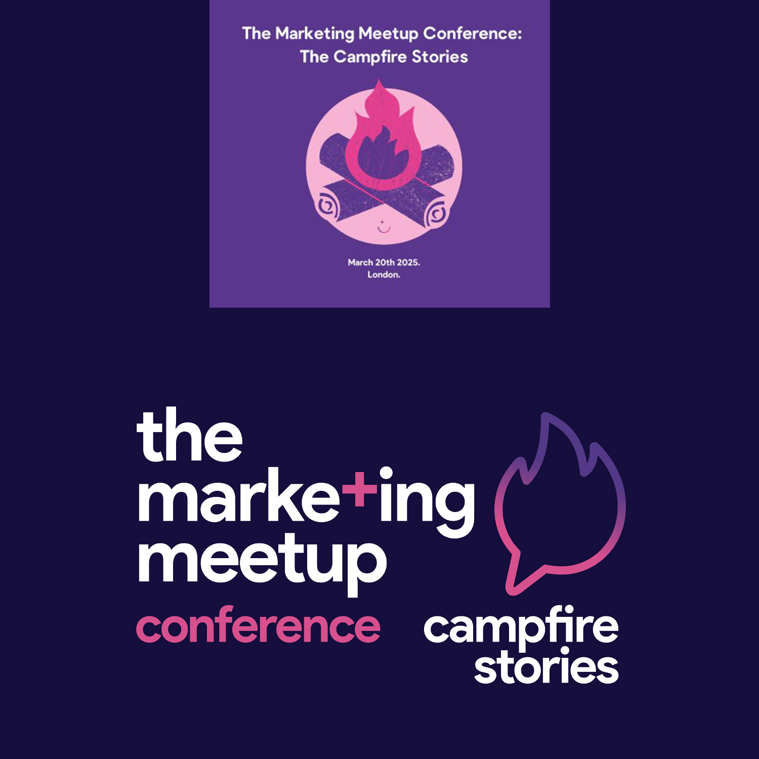
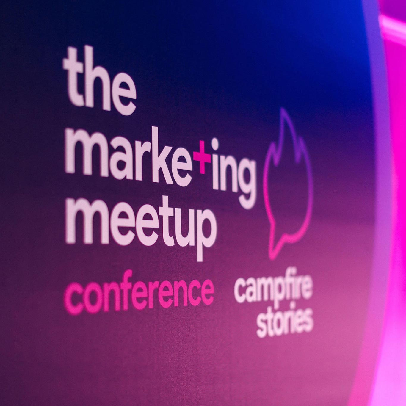
The conference had already launched – complete with an in-house logo built around the theme Campfire Stories. And that logo was, quite literally, a campfire. Four months after the conference was announced – and four months before doors were due to open – we were brought in to rebrand it. Because sometimes good teams move fast. And sometimes they realise fast that they need better.
The challenge
The original mark wasn’t bad. It was just obvious. Too literal. “Too on the nose” as co-founder Joe Glover later admitted. It didn’t quite hit the mark.
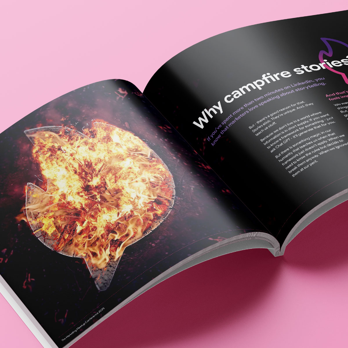
And branding, especially for an audience of marketers, needs to do more than illustrate the theme. It needs to communicate ‘the why’.
“Campfire Stories” holds tension. A campfire speaks to warmth and belonging; stories speak to energy, vulnerability and momentum. The identity had to capture both – without defaulting to cliché.
We weren’t designing for a casual audience. We were designing for marketers. Professionals who notice and value integration. People who expect more. So, the task wasn’t just to tidy up a logo. It was to elevate the entire conference into a flagship brand – quickly, confidently and without destabilising what had already been launched.
The hot solution
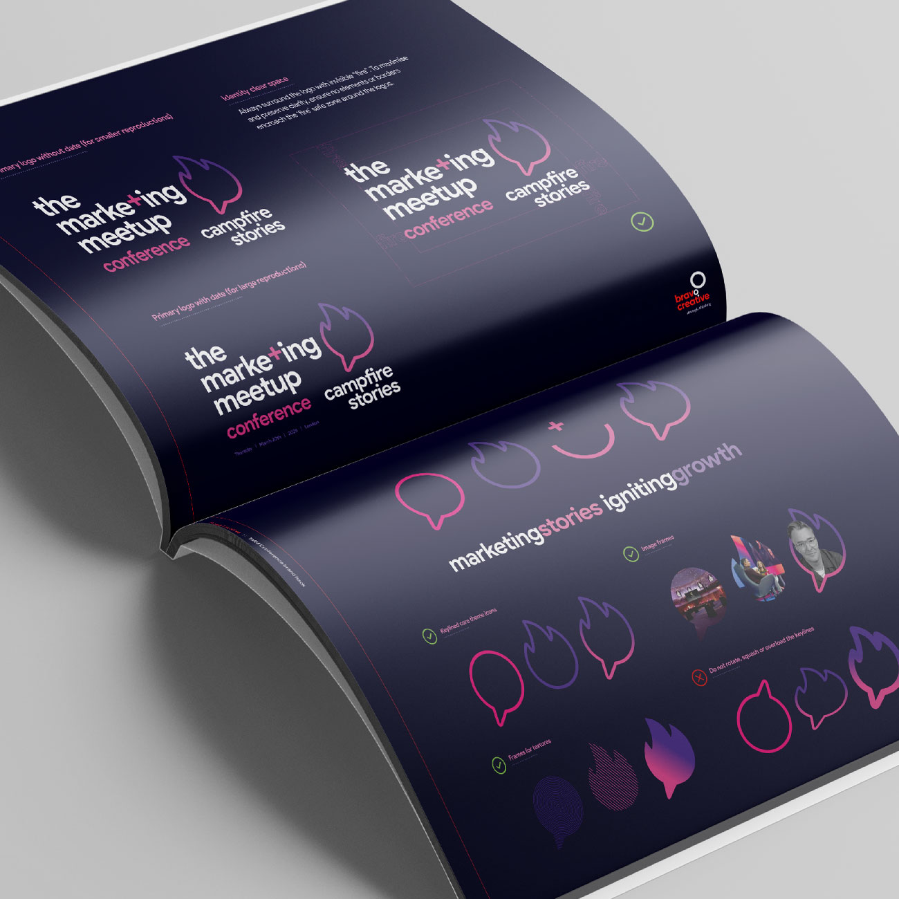
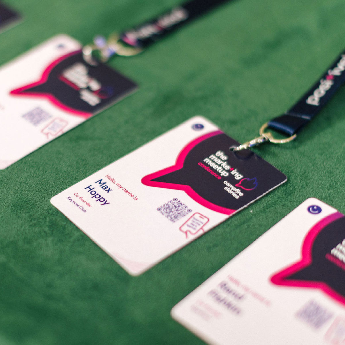
After plenty of scratched brows and a frankly unhealthy number of sketches, the solution emerged in the form of the ‘Hot Talks’ icon – a single, confident sub-brand device combining a flame at the top and a speech bubble at the base.
Two meanings. One mark. No clichés.
The flame carries heat, spark, and ignition. The speech bubble anchors dialogue, perspective and shared stories. The Hot Talks icon didn’t show a campfire. It expressed the energy behind one.
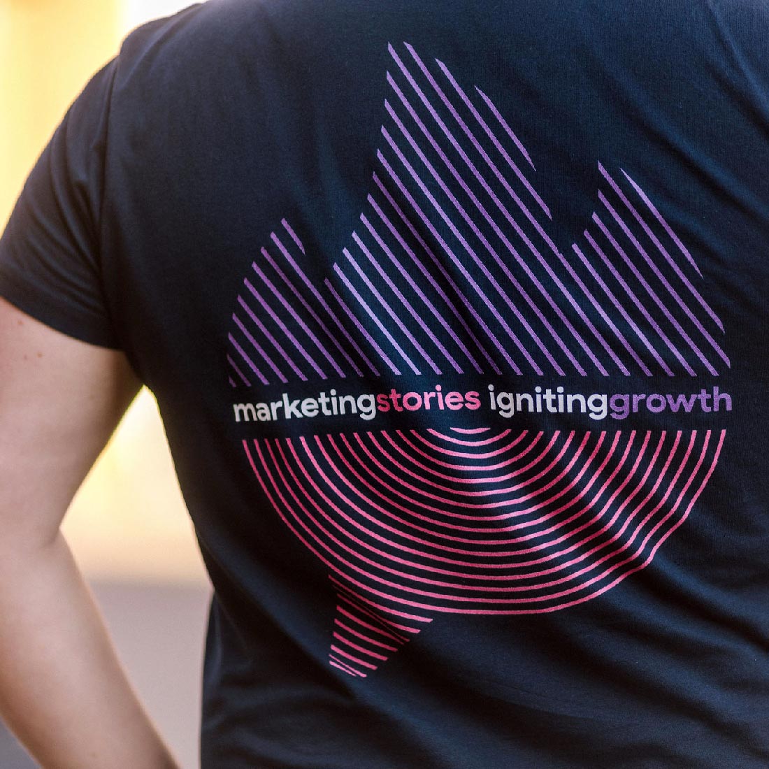
Crucially, it wasn’t just a new logo. It was an entire system.
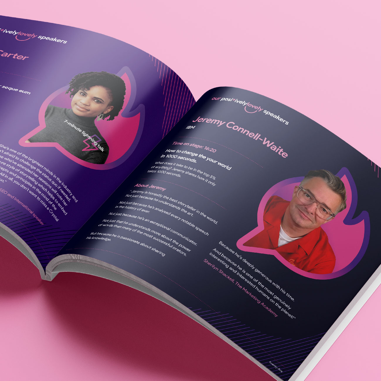
The shape became a framing device for speakers, a container for typography and texture, and a scalable asset that could flex from small social graphics to immersive stage backdrops. It gave the conference its own identity while staying unmistakably part of The Marketing Meetup family.
Integrated brand experience
This wasn’t a cosmetic update. It was a full rebrand under pressure – designed, refined and rolled out in the four months leading up to the event.
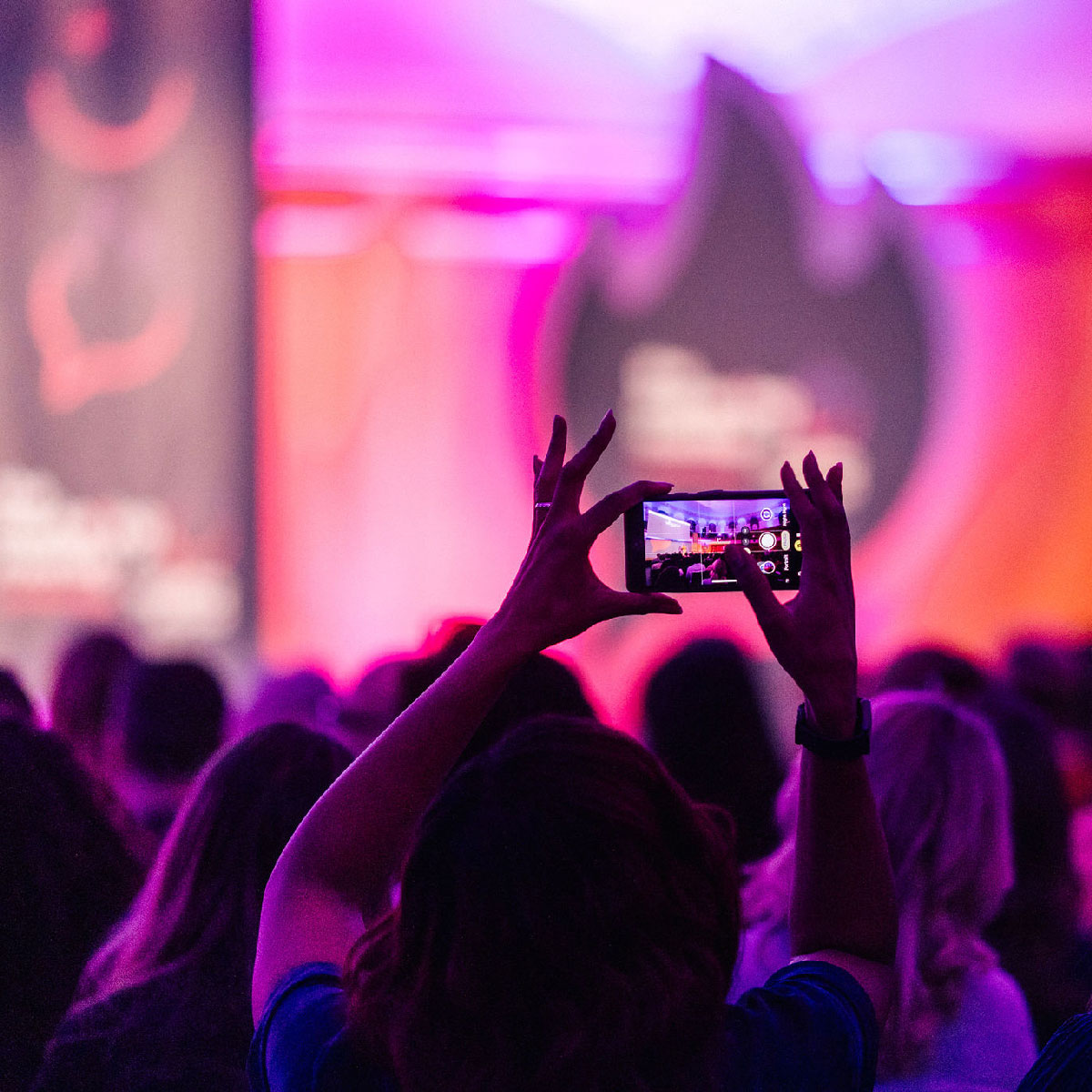
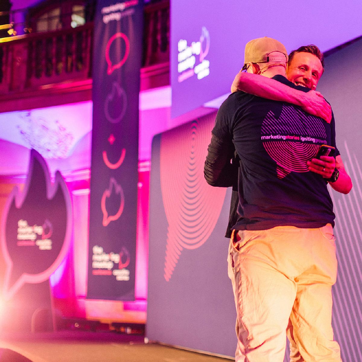
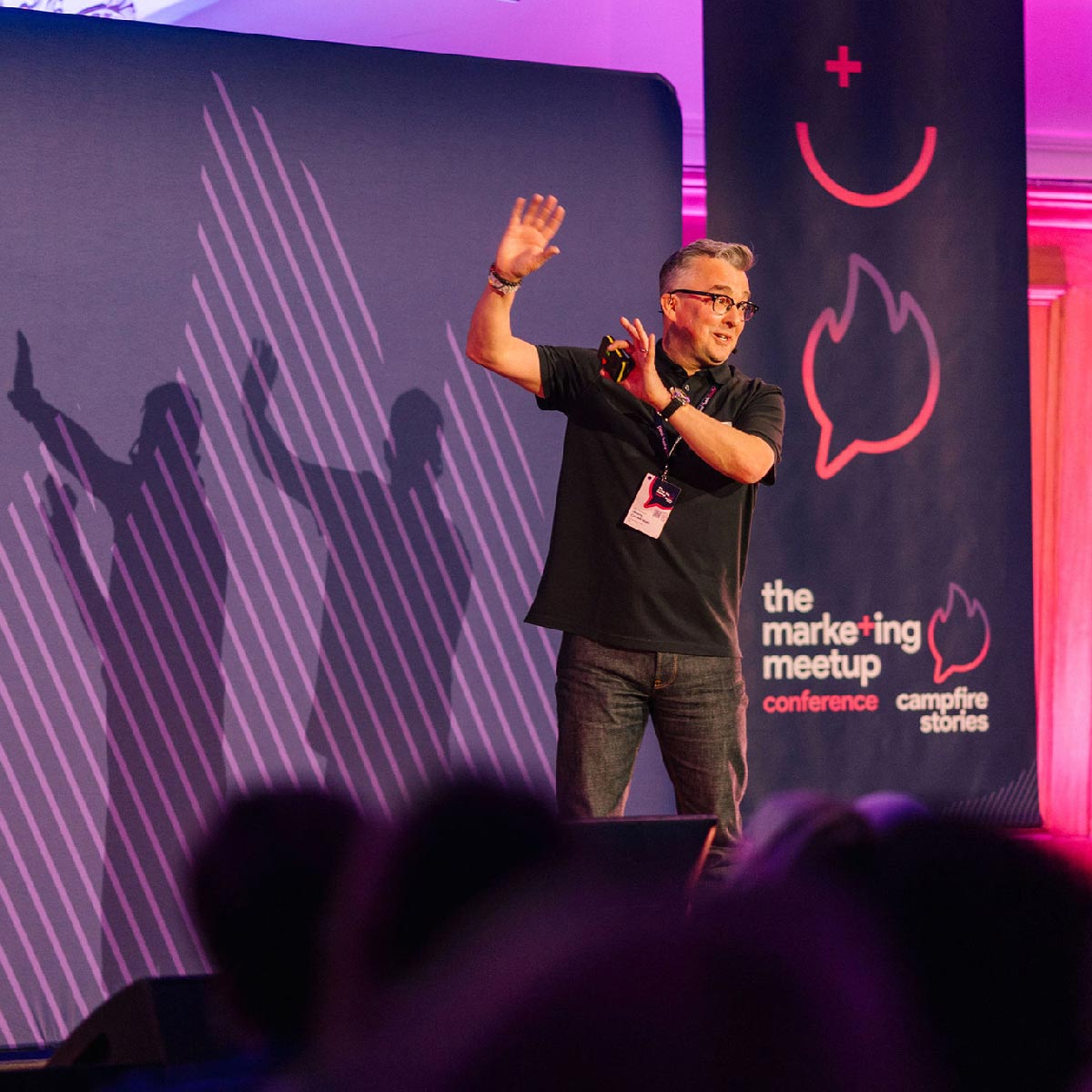
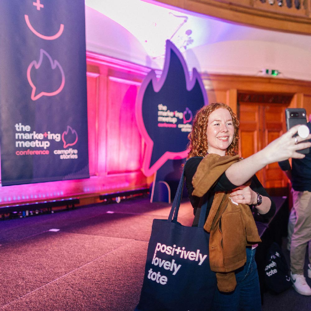
The Hot Talks system shaped everything: the programme, lanyards, event maps, tote bags, apparel and stage design. On large-format screens and backdrops, the device anchored the physical space, ensuring the brand felt immersive rather than applied.
Pre-event, we launched a personalised “Flamin’ Great” social tile built around the Hot Talks icon, allowing speakers and attendees to proudly share their involvement. In the weeks before the conference, LinkedIn became a subtle but powerful showcase of the new identity – building anticipation and signalling a step-change in ambition.
From announcement to applause, the brand didn’t sit on top of the experience. It ran through it.
Strategic thinking
Rebranding a conference four months after launch – and four months before showtime – could have been risky. But it was the right move. However, the real test wasn’t whether it looked good in year one. It was whether it set a benchmark for the next five.
The original in-house logo would have dated quickly and limited growth. Our Hot Talks system created flexibility – a platform that can evolve with future themes while retaining recognisable equity. It gave the conference presence. Energy. Confidence.
The result was an inaugural event that didn’t feel like a Meetup made bigger. It felt like a flagship from day one. And when your audience is marketers, that matters. This wasn’t just about designing something attractive. It was about elevating perception, building long-term brand equity and doing it under real-world constraints.
There’s a lazy cliché in our industry – style over substance. But when the creative foundations are strong enough, that debate disappears. It’s what we like to call “stylised substance” – ideas that look good… because they’re meaningful.
And when a branding system holds up in a room full of marketers, you know it’s working.
SERVICES
• Rebranding
• Brand consultancy
• Visual identity & design
• Proposition creation
Scroll down to view the branding and photos from the event
Branding before and after, design system, and event photos - courtesy of iggyandlime.co.uk